Background
FurEverHome was created in a group of four as a platform to support new and prospective rescued dog owners in their journey with their beloved furry friends. Utilizing Figma over 6 weeks, I was primarily responsible for user research and testing, creating different iterations and features of the UI as well as prototyping a fully working prototype of one of our experience flows in the application.
Jump to proposed application ↓The issue at hand
Approaching this project, my teammates and I first sought out research and journal articles to familiarise ourselves with this domain. These articles pointed to resistance among potential and newly rescued dog owners with a survey done by Orvis and Spots noting 60% of adopted pets are returned or given away after 6 months, citing concerns about potential health risks and a lack of knowledge on how to effectively care for rescued pets.
"42.8% of pet owners favors shelter or rescue adoption for the chance to give second chances, however, without proper guidance and support, they may face challenges in ensuring successful and lasting adoptions"
— The Zebra’s 2023 survey with 1500 participants
Jumping down the rabbit hole
User Interviews
To gain a better understanding of how pet owners and pet shelters, the team conducted user interviews with 7 participants on both Zoom and in person, with 4 people who adopted from breeders, 2 who adopted rescues and a volunteer from the SPCA, a local animal shelters.
These interviews pointed to the general mindset of online information being sufficient but preferred hearing stories from experienced pet owners for specific insights. Common issues faced by pet owners include health, hygiene, and behavioral concerns with their pets, while common reasons for adopting pets include companionship, a love for animals, and a desire to practice caregiving.
"I have heard that rescued animals don’t live as long because of their trauma but I’m not sure how true it is."
— An interviewee who previously bought his dog from a breeder
"Not everyone can comfortably communicate with other people but with pets they can express themselves easier."
— An interviewee who has bought and adopted pets in the past
Persona and their journey
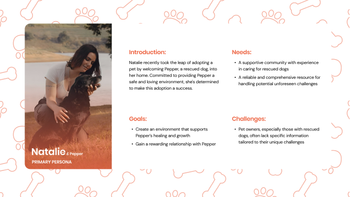
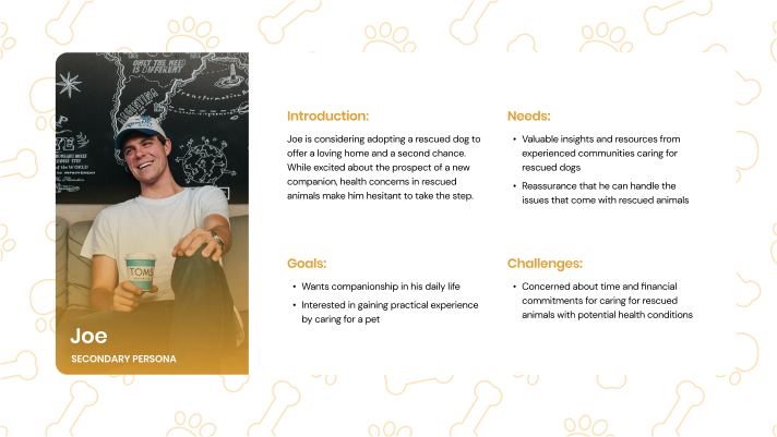
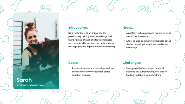
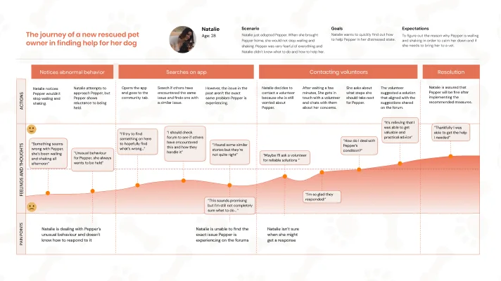
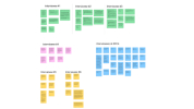
Synthesizing all the insights we gather through our research, we created 3 different personas that represents the different potential users of the application. From that we also created a user journey map to help the team further understand the different touchpoints and emotions a newly rescued pet owner, who the team identified as the primary user, might have to guide our design decisions in developing the application.
Low to High Fidelity Wireframes
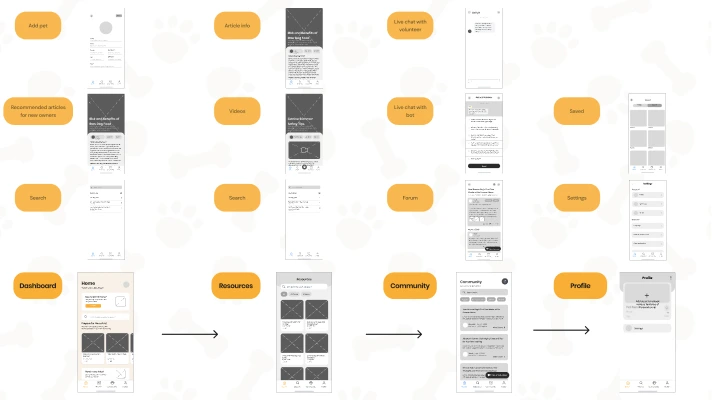
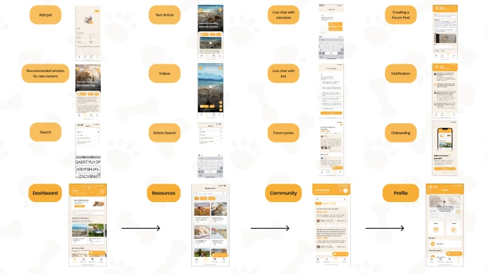
When wireframing the application in grey box form, as a team, we all took part in coming up with different designs and ideas. When it came time to fully flesh out the screens, we diverged with each person taking a different user flow and having a daily meeting to discuss our progress and address encountered issues collaboratively. I was in charge of wireframing and prototyping the potential user flow for while supporting my team for the primary and the volunteer flow.
Competitive Analysis
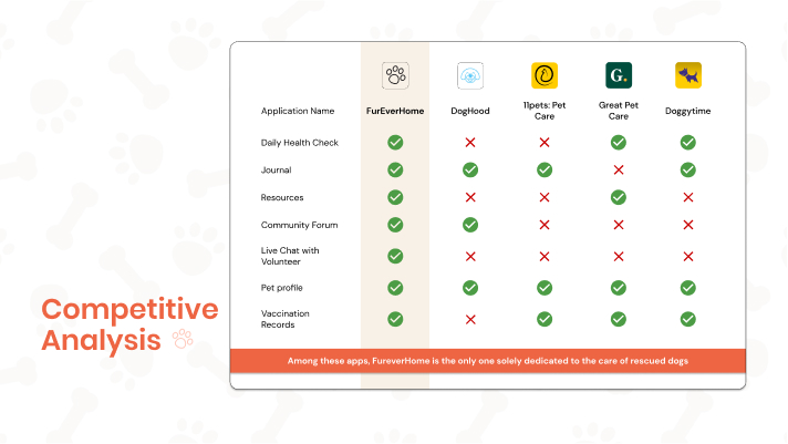
To better understand how FurEverHome could differentiate itself, the team conducted a competitive analysis across various popular dog pet app online. One thing that we noticed while researching was that apart from encompassing a wider selection of features than other pet dog apps, FurEverHome truly stands out as the only application on the market that focuses solely on rescue dogs.
User Testing and Addressing Issues
To gain a better understanding of how users would approach FurEverHome, the team conducted in-person user testing with 8 people consisting of 2 primary users, 4 secondary users and 2 volunteers, asking them to perform a setlist of different tasks utilising observation and the think-aloud method in combination with questionnaires.
However, after conducting these interviews, it was pointed out that while the features were well throught out, the prototype at that time still had issues with usability in parts of the UI and copywriting in the volunteer flow. After considering the user’s feedback, as a team, we made adjustments and fleshing out the UI even more with usability being our top priority and improving on the copywriting to better communicate to users better. These changes led us to create our fully interactive prototype with 3 distinct user flows. Here I was in charge of primarily in charge of prototyping the prospective user flow as well as helping my teammates prototype the primary and volunteer user flow
Introducing FurEverHome
Aiming to support both new and current rescued dog owners through working alongside local shelters and organizations such as the BC SPCA, we came up with "FurEverHome", the first app of its kind that focuses on making sure every rescued dog receives the love, care, and attention they deserve. View the pitch video here if you're on mobile!
Experience the interactive prototype here!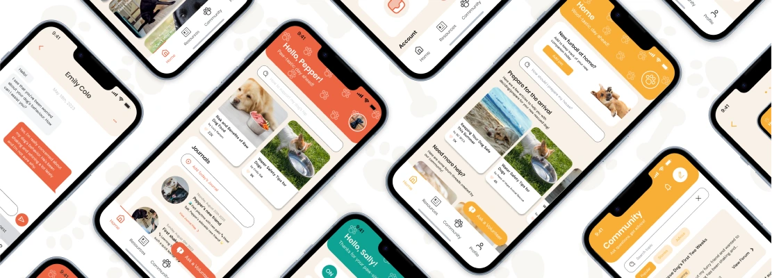
Tailored Experience
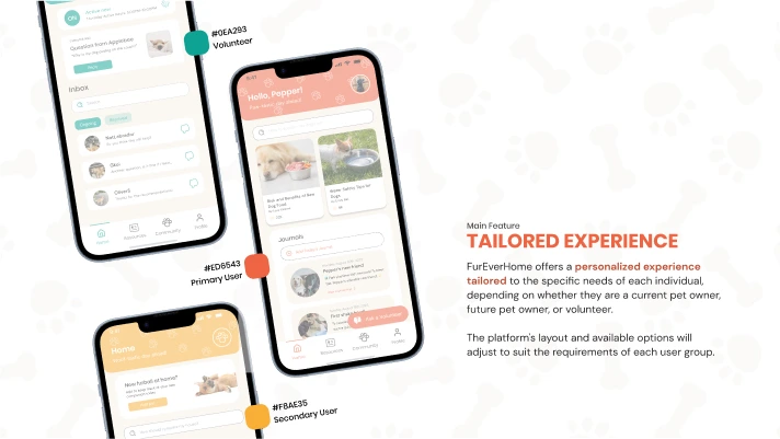
Offering a personalized experience tailored to the specific needs of each individual, depending on whether they are a current pet owner, future pet owner, or volunteer with different layouts and functions made available for each group, further separated by the main color theme.
Ask A Volunteer
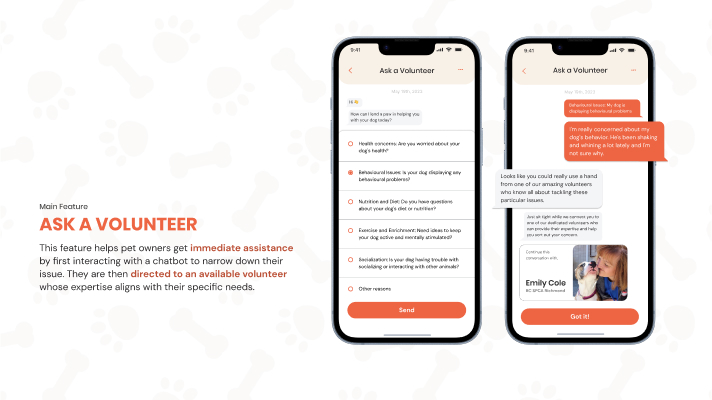
Users can explore posts contributed by other users and volunteers, providing a rich source of information and insights. Active participation is encouraged, as users can create their own posts to ask questions and seek advice from others in the community. Upon reaching 1000 PawPoints, which are measured based on the helpfulness of their posts as voted by other users, they will have the opportunity to earn a volunteer badge for their invaluable contributions to the community, offering them a way to give back to the community.
Curated Resources
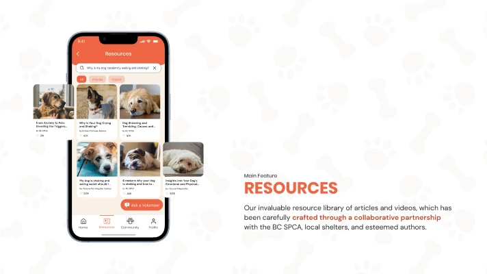
Through working with local shelters such as the BC SPCA, the Resources tab includes a library of articles and videos made to help guide pet owner throughout their journey with their furry friend.
Reflection
As my first real UI/UX project that I have done in my academic career, I’m really proud of what my teammates and I were able to achieve, gaining both praise from fellow classmates and the teaching team during our final showcase. I was able to learn how to efficiently prototype a fully functional prototype application using Figma's components.
I've also gained a better understanding of the importance of qualitative research and its differences from quantitative and secondary research. I also learned how to create interview questions that don't lead the interviewee and encourage them to provide detailed and natural responses. Furthermore, I gotten more experience of collaborating within a team when developing a mobile application, especially keeping each other informed, and most importantly working together to overcome challenges we encountered basing our decisions on our research and user’s insights.