Background
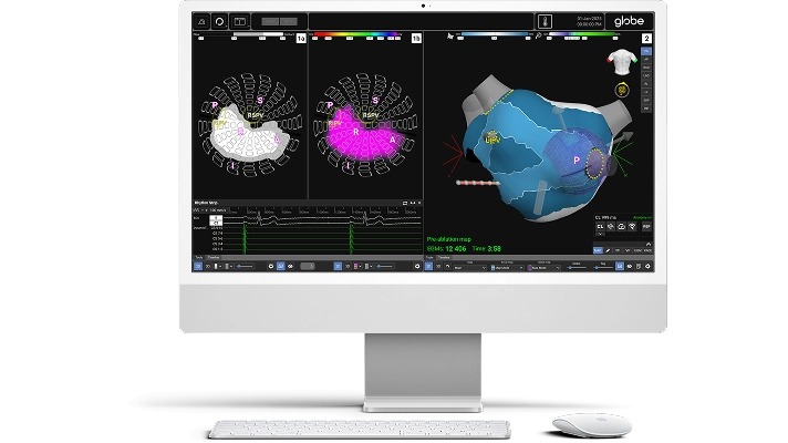
The Globe Pulsed Field System, developped by Kardium, is a new tool that assist the treatment of atrial fibrillation (AFib), aiming to help more than 50 million people worldwide through making procedures more accurate and efficient.
My primary role in this project involved conducting design audits, ensuring accessibility compliance with WCAG standards, managing the design library, and creating guidelines for future development.
NOTE: Due to NDA restrictions, this case study will only highlights the key tasks I contributed to creating standard guidelines for Kardium's design system at a high-level with contents replaced or left out. If you'd like more details about my work, please feel free to contact me via my email!
The Challenge
With the Kardium’s first commercial cases happening in 2025, it was clear that the Globe Software will need to be as feature-packed as possible to compete with existing competitors in the market.
However, this rapid cycle of implementation meant inevitably creating an increasing divergence between the UX and development teams' design libraries. Each team would rely on its own tools and naming conventions for different workflows, resulting in inconsistencies, friction, and a design system that made collaboration difficult. Even minor changes could take days to implement, slowing both teams down and making iteration frustrating given the nature of back and forth conversations.
"How might we standardize our design library to streamline development process, reduce the visual "junk" for physicians while allowing for future improvement and features?"
— Senior UX Manager
"While I could make a judgment call based on the (current spec) guidelines, I think it would be better for UI/UX to make the final decision—ideally with a mockup (standard) to guide implementation"
— Staff UI Software Developer
A flexible design system for both
Conducting Design Audits
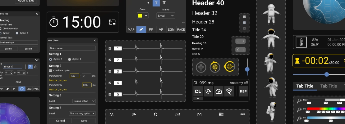
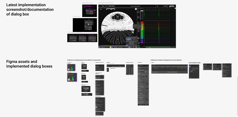
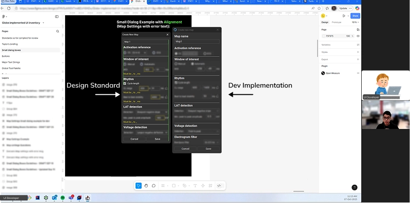
Starting in June, I took on the responsibility of managing our design library, with the first step being to conduct design audits of Kardium’s current Figma asset library and software implementations of different design elements such as dialog boxes. From this I synthesized the common design patterns, what was working well and areas that needed improvement, as well as discovering the differences between the design mock up specs that the UX team were creating versus the software implementation by the UI developers.
The audit process also involved 1:1 meetings with UX Designers, as well as meeting with UI developers from the development team to understand the process and workflow in implementing a feature after receiving the mockup specs from the UX Design team.
Rebuilding from the atoms up
I collaborated with our Senior UX Manager and a Staff UI Software Developer to start refactoring our UX design library from the atom level in form of fonts, matching the UX’s library to the list of different font sizes and naming scheme in the software provided by developers’ team and from there, working my way up, updating the buttons (molecule), dialog sections (organism) and ending with template/page in the form of a sample UI frame with all the elements from the design system.

Clear specs standard and faster implementation
Before, handing off work would always meant some level of manual interpretation between designers and developers. That left room for small discrepancies and slowed down implementation.
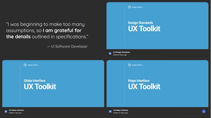
Now with the newly unified set of design standards, the handoff process became radically simpler. Every component, comes with an annotated sheet with examples, general specs, documenting supported states, and accessibility guidance. UI Developers and Product UX Designers now work from a single source of truth—reducing ambiguity, eliminating redundant documentation, and accelerating time to implement features.
Reflection
The experience I gained at Kardium was invaluable in my journey as a designer as I was able to see various projects from start to finish in a real world setting. During this time, I was able to polish my eye for UX/UI designs, focusing on accessibility while practicing soft skills; learning how to present to stakeholders and engaging with real users while conveying concepts in an easily understood manner, synthesize insights and organizing my day-to-day in order to follow the increment cycle for development.
While my time working at Kardium has ended, it’s quite exciting to see the various features that I have designed got so many endorsements from veterans users in the field and are anticipated to be rolled out to the various clinics and hospitals across the US, Canada and Europe in the near future!
"The feature and interface is brilliant! It would help us a lot in future procedures."
— Doctor from Royal Jubilee Hospital on a soon to be released software feature
"I could give the person who designed this a hug!"
— Senior Clinical Software Operator on a soon to be released software feature