"For Asians and Asian Americans and just Asian youth globally, there’s no real home on the Internet, or a company consistently putting out things that either include Asian talent or Asian viewpoints in stories."
— Sean Miyashiro, Founder of 88rising

Setting The Stage
88rising is a multi-media record label that aims to create a platform for Asian and Asian-American talents, bridging the gap between the East and the West. They have quickly became a cultural phenomenon, gaining over 3 billion views within 3 years on YouTube.
However, 88rising has since faced issues with discoverability. Within the past 4 years, they’ve only accumulated 0.43 billion views on YouTube and have struggled with providing their new artists with the same reach that they formerly had.
During this 6 weeks long project, I led the user research, as well as contributed as a interaction designer while also being the decision maker during our design sprints.
Jump to proposed intervention ↓A Sneak Peek of Our Solution
User Research
The root of the issue
To better understand 88rising's audience the team conducted 15 user interviews and received 89 responded to an online survey asking casual to die-hard fans regarding their music-sharing habits, and their perception of 88rising and its artist roster.
These interviews pointed to a lack of awareness within the fanbase of 88rising’s frequent releases which leads to their decline in popularity with 62% of respondents not aware of their monthly releases and 41% of fans respondents attributed the decline due to the lack of engagement from the brand themselves, despite having an interest in 88rising’s new talents and their signature sounds.
"It feels like the big names are stagnant while majority of the new artist are spread thin or not enough exposure."
— Survey Respondent, talking about how 88rising is declining in popularity
"They give more variety of artist for people to discover. And something new to listen to. A different sound from the usual big names..."
— Survey Respondent, talking about 88rising's newer artists
Framing the issue
After considering both the business and consumers’ perspectives, my teammates and I saw a missed opportunity for 88rising as many fans weren’t engaging and discovering more of 88rising’s roster due to many of their artists and collaborative content being scattered across different platforms. As the decision maker for the team, I believed that by leveraging 88rising’s unique Asian American identity and collaborative works from diverse artists across different cultural backgrounds, we could help fans discover and connect more with artists and provide artists with a piece of the spotlight they have lacked until now.

Current Touchpoints
YouTube
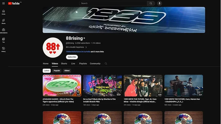
From our research and design sprints, YouTube currently serves as 88rising’s main platform to share original content featuring their various artists. However, music videos, behind-the-scenes, interviews, and other collaboration content are burried and scattered across various channels, making it challenging for fans to discover and connect with their favorite artists.
88rising Wesbite
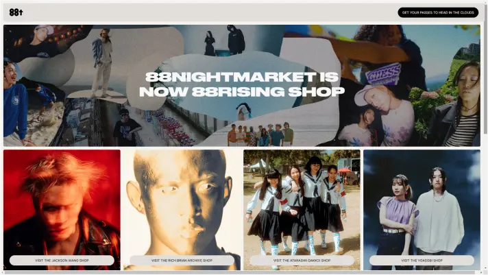
Additionally, 88rising’s current website only focuses on merchandise sales, lacking any clarity on their current roster of artists, what the brand is about, and any information about the personalities surrounding the brand.
Inital Ideations
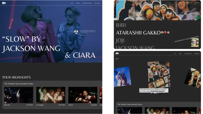
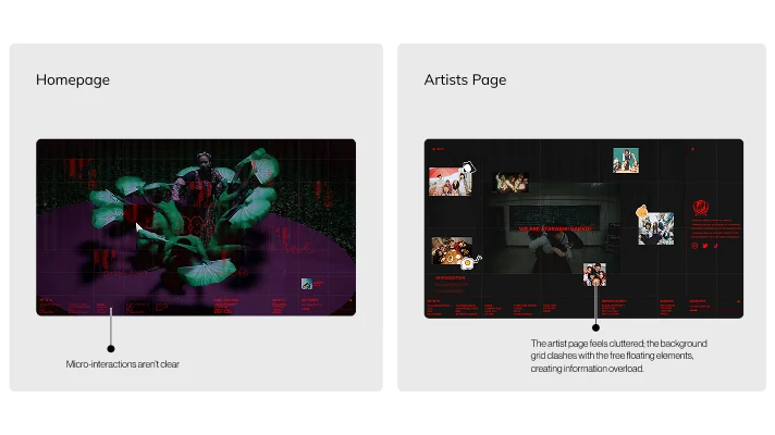
While these first few iterations had potential, the execution wasn't there just yet in terms of interaction and visual design. As such, we refined our approach to better balance 88rising's goals with our content strategy. In this stage, I led the design of the layout, interactions as well as content organization of the landing page and the artist page. While this improved the overall concept, the artists' page was noted for lacking cohesion and needing stronger integration with the site's design.
Result
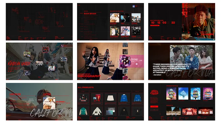
This intervention invites both fans and visitors to explore 88rising as a whole and delve deeper into artists they may not have heard of previously. Throughout the site, fans can watch and listen to different collaborations and stories from artists, revealing the inspirations, cultural context, and symbolism of their songs while also giving fans a preview of who they are behind the screen. View the pitch video here if you're on mobile!
Experience the interactive prototype here!
Connecting Through Languages
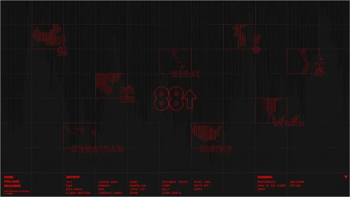
Our research showed that similar to 88rising’s artist roster, their fans are spread across the globe, having different cultural backgrounds and experiences. The use of different languages when they first land on the site helps ease fans into new artists by establishing relatable connections based on language and culture. This helps provide a starting point and draws in casual audiences unfamiliar with where to begin.
Interweaving Voices
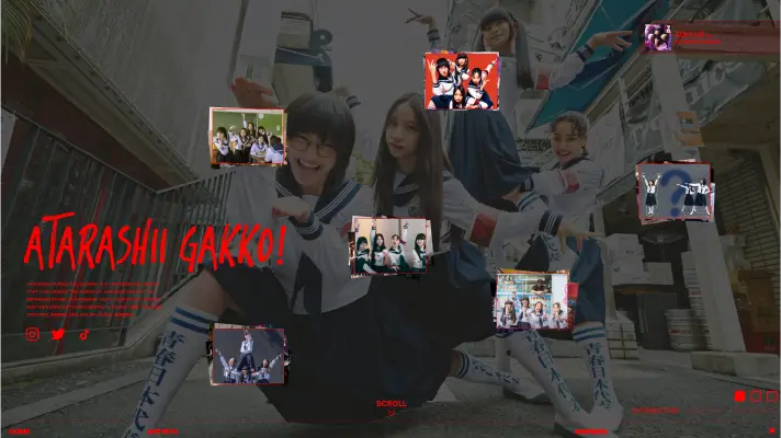
Each of 88rising’s artists pairs unheard voices with a distinctive style that sets them apart from conventional artists and each other. To express this, the artist collaboration page strayed away from traditional grids as a way to provide a more vibrant and energetic experience, with the use of opposing motions representing a new wave of clashing cultures.
Adaptable Individuality
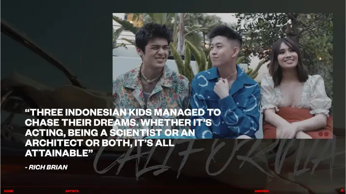
Each artist page features image stacks, efficiently organizing a large amount of relatable and personal artist content across different platforms onto a single screen. This design enhances accessibility for casual fans, allowing them to easily go down the rabbit hole about the artists they find intriguing. Furthermore, the design's adaptability extends to various artists, serving as a versatile framework applicable to different members of 88rising's roster.
Fully Responsive
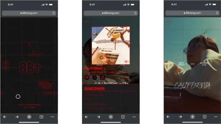
As many fans consume music-related content primarily through mobile devices, our next step is to adapt the desktop design into a mobile-friendly experience. This involves rethinking how interactions and content layouts translate to smaller screen sizes, particularly as the desktop design relies heavily on hover-based interactions. Experimenting with touch-based interaction systems will be crucial to ensure a seamless and engaging mobile experience.
Stakeholder Value
88rising (business)
Creates a loyal fan base through increasing song engagements and merch sales. Highlighting lesser known artists to deepen their talent pool all while further promoting Asian American media to mainstream global audiences.
Fans (Consumer)
Helps create a more diverse music & artists range through enhanced discoverability and deeper artists engagement. Fans gain an appreciation of the artist’s creativity, influences and personal experiences.
Reflection
Looking back, this was definitely the most challenging project I’ve been a part of and it was really an eye-opening experience, especially during my first-ever design sprint where I got the chance to be the team’s decision maker. I learned how to frame problems properly, make design decisions, and quickly generate and test those ideas. This rapid and hyper-focused process of iterating and feedback between user interviews and the teaching staff taught me to challenge every assumption I might have through research data.
Another crucial lesson that I learned the hard way is to truly trust the design process. In the beginning, the team spent 3-4 weeks constantly doubting ourselves as we weren't able to lock in the "perfect" problem space rather than letting the framing develop as we research and gather more insights. This constant back and forth delayed the project until the final weeks of the project timeline.

