Overview
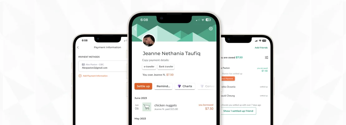
Splitwise, a payment app that automatically calculates multiple bills and splits expenses, makes it easy for friends, roommates, and groups to track and organize shared expenses so everyone can settle up fairly. However, the platform relies heavily on a trust-based system where users must manually log and approve expenses. This can create uncertainty or disagreements, potentially straining real-life relationships when expectations or entries don’t align.
Jump to implemented feature ↓Research
To start our research for the app, we first looked at the app itself, studying its existing design system and interaction. Additional, the team also conducted research online in journals articles to find potential problems with Splitwise currently, this would help us narrow down our scope and assist us with identifying what we wanted to look at during our primary research being user interviews and observing users interacting with the app.
These articles hinted at the potential friction between users as Splitwise relies on the trust system to manage people's expenses which could strain their in-person relationship.
"I am two degrees of separation away from a woman who lost an entire friendship group because she clicked “settle up” on Splitwise after a holiday but never actually made the bank transfer, and doubled down when she got found out."
— The Guardian's review of Splitwise, 2023
Competitive Analysis
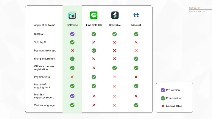
To better understand how Splitwise can stand out within the bill-spliting applications market, the team conducted a competitive analysis on other expense spliting application to help us understand what features Splitwise have and how they compare with others in the same domain. As Splitwise has both a free and pro version, we had to take into account of the different features they offer.
User Interview Insights
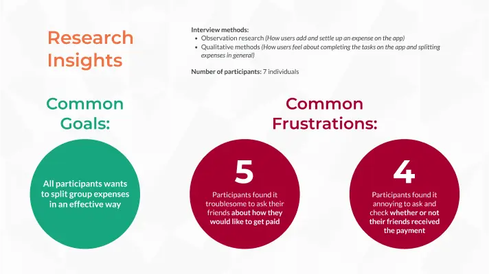
To get a better understanding of what frustrations current users have with Splitwise, we conducted two rounds of on-site user interviews with 7 participants each time. While there were various issues and potential improvements to the app that the interviewee would like to be implemented, these interview pointed towards a general frustration when they aren't aware when and if they received money from their friends and also found troublesome to ask acquaintances to settle up their debt due to social pressure.
Brainstorming and Persona
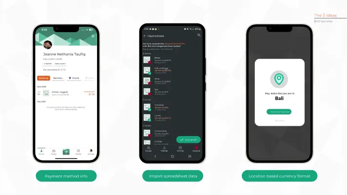
In our interviews with users, our team presented with 3 initial options: A preferred payment info to let people know how to pay someone, an import spreadsheet feature to help new users coming from other expense tracking apps and finally a location-based currency feature that automatically changes the currency based on the user's location and numbering format of a specific currency.
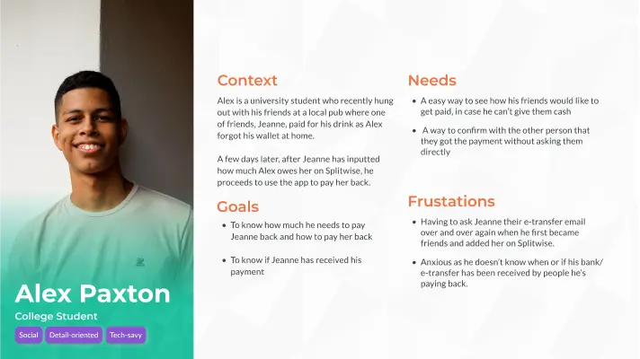
After doing a second round of user interviews, the team decided recommend the payment information feature with an added functionality being a 2-way verification feature. In the process, to help us visualize our users and how they would approach Splitwise and our proposed feature, we formed a main user persona below.
Implemented Feature
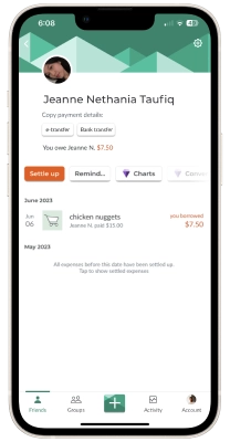
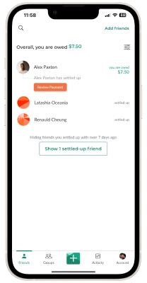
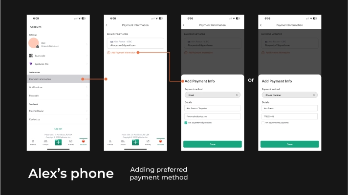
The "Payment information and 2-way verification" feature lets users see their friends' preferred payment methods when settling debts. Additionally, through real-time updates, users can see the status of their payments and know precisely when they have been received. Simplifying the process of managing shared expenses streamlines the process and ensures peace of mind for all users involved
Final Interactive Prototype
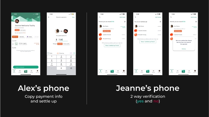
As the interaction designer of the team I wanted to showcase the different scenarios that users might go through and as such the team created 3 different user prototype flows and make a short motion graphic displaying how our main user Alex would utilise Splitwise's new feature which can be seen through the videos below or through the interactive prototype!
Use fullscreen for the best experience of the prototype.
Reflection
Through working on this project, I have gained experience with working with an existing visual and interaction design system. It has also reaffirmed the importance of designing for actual users' needs and not simply using assumptions from the design team! I've also gotten an understanding into how UX and product designer would constantly ideate and develop new ideas to further improve their products to elevate the end user's experience.
